Melo
Brand Strategy, Naming, Copywriting, Art Direction, Branding, Packaging
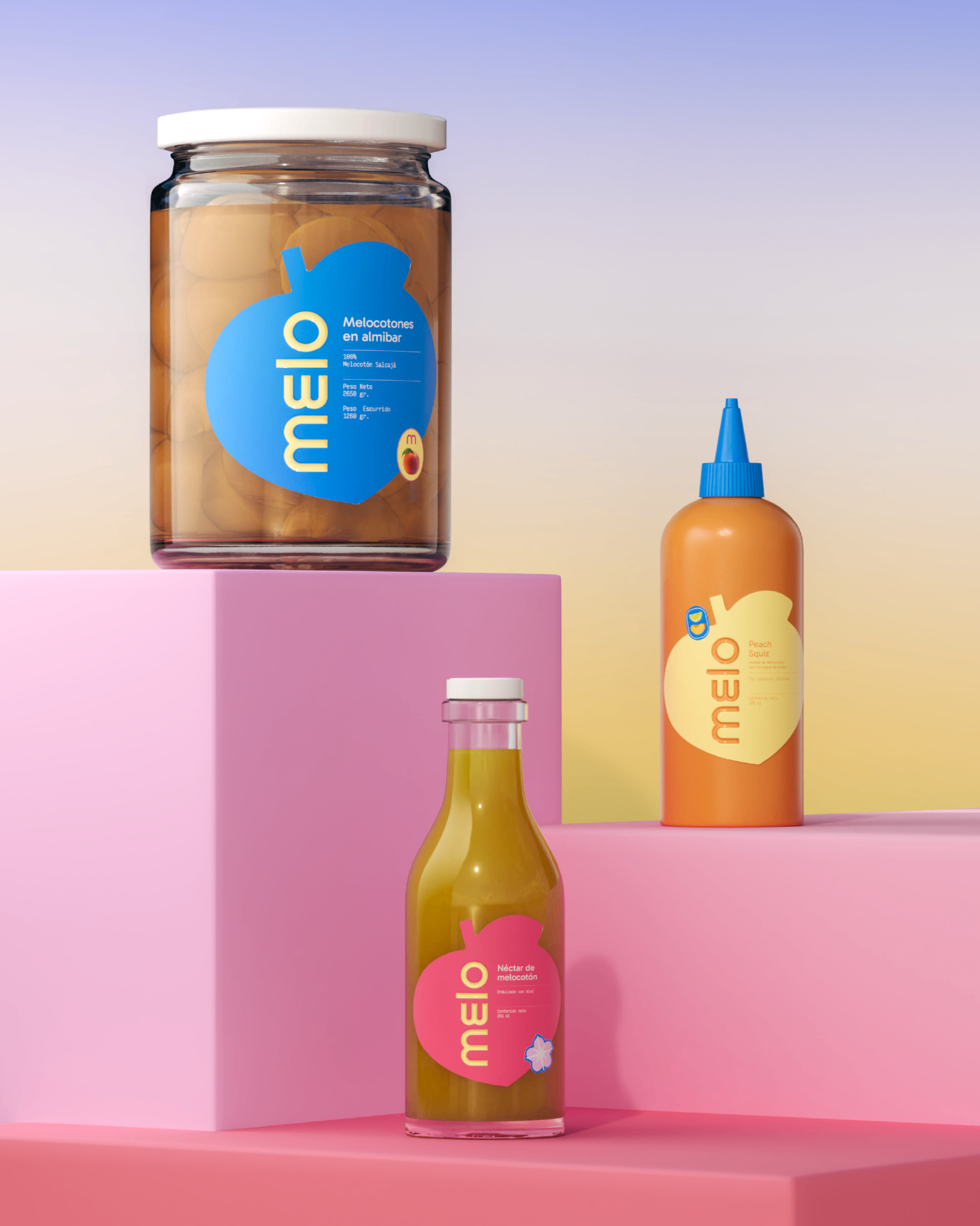
Branding for MELO, a product line made from peach-derived goods, born in Salcajá, Quetzaltenango, Guatemala — a region known for its agricultural heritage and seasonal fruit culture. The project reimagines the peach as a contemporary symbol, translating a local product into a fresh, playful, and highly visual brand directed toward a young, Gen Z–driven audience.
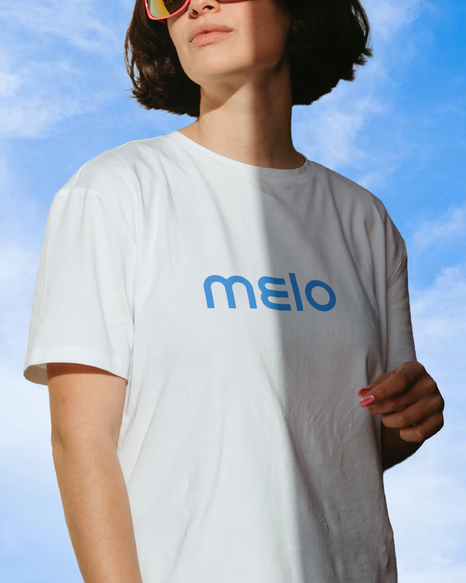
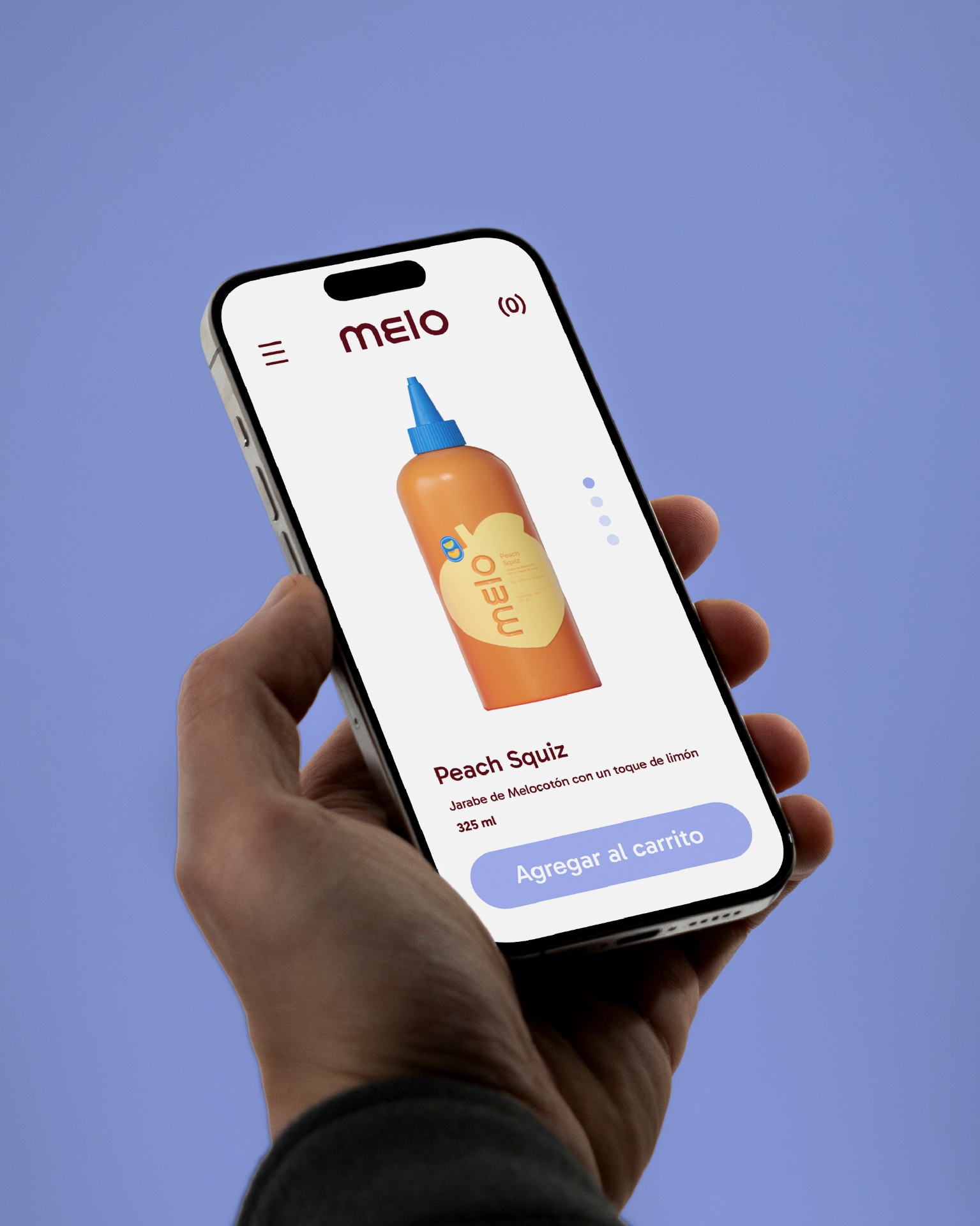
MELO is built around the idea of "spring energy": light, juicy, optimistic, and unapologetically fun. The brand embraces bold color contrasts, soft organic shapes, and a graphic system inspired by the natural form of the peach, allowing the identity to feel approachable while remaining visually distinctive across physical and digital applications.
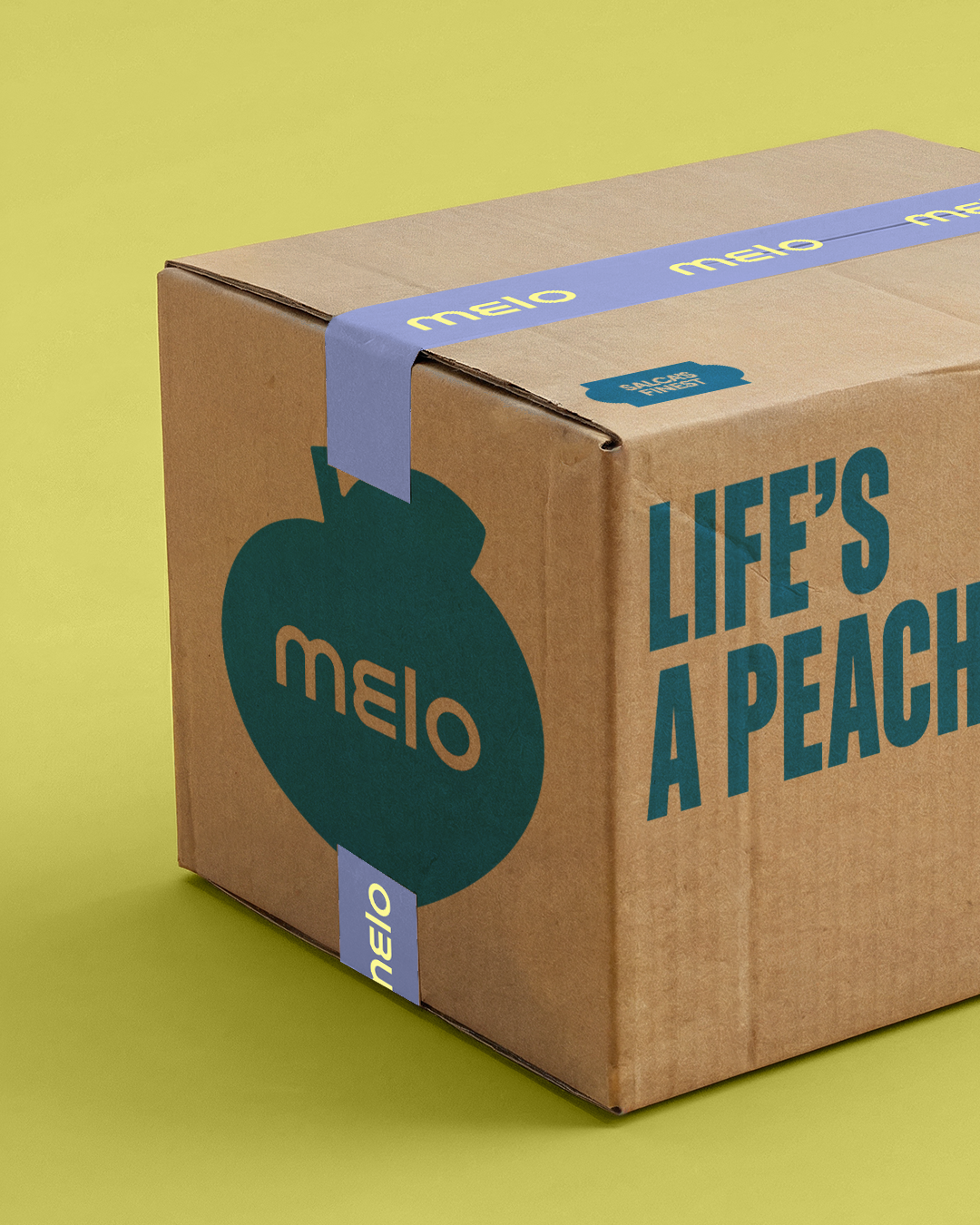
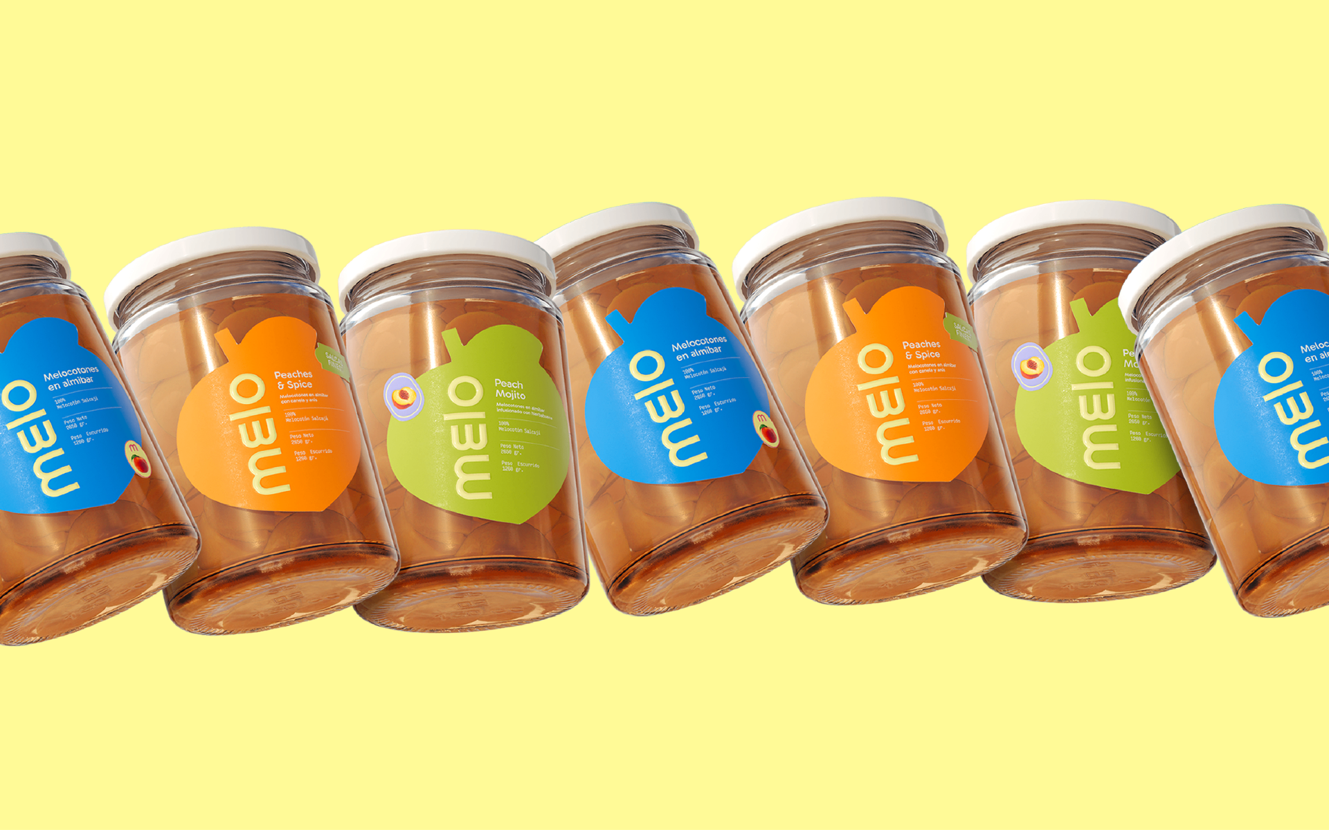
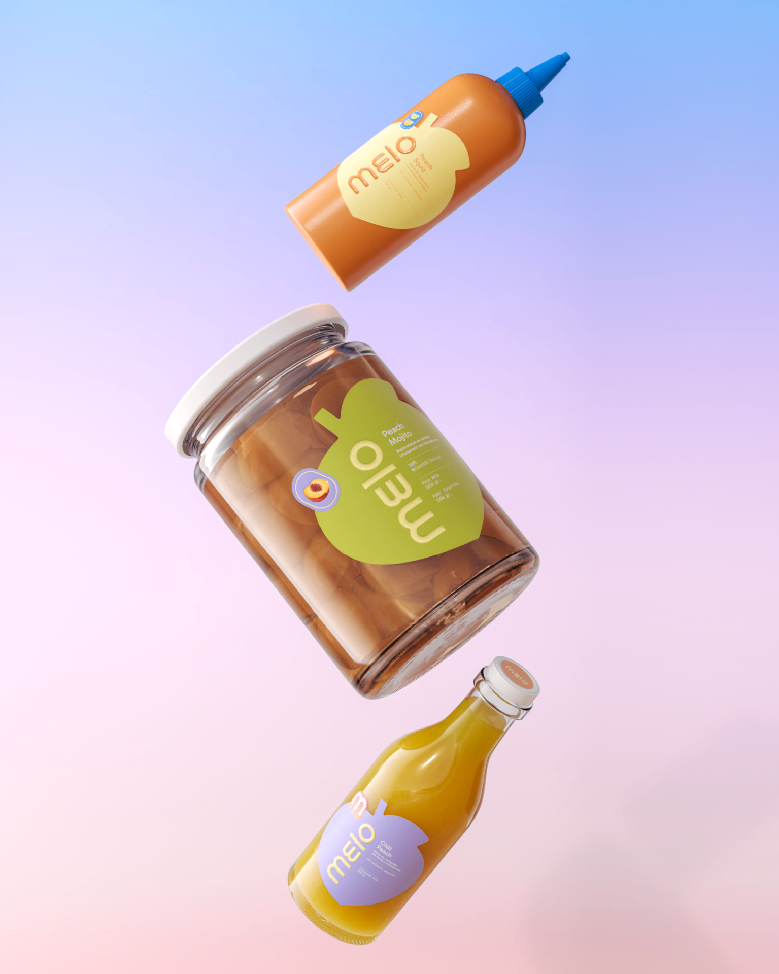
The visual language is centered on a flexible logo system and vibrant packaging that highlights freshness and transparency. Stickers, labels, and graphic elements are designed to be modular and expressive, creating variation while maintaining strong brand recognition. This approach allows each product to feel unique, almost collectible, while staying part of a cohesive system.
Packaging and renders play a key role in the brand's communication. Hyper-real textures, exaggerated scale, and playful compositions emphasize the sensory experience of the product — juicy, soft, and natural — while aligning with Gen Z's visual culture and social-first consumption habits. Short phrases and graphic cues reinforce the brand's tone: casual, honest, and direct, without losing clarity or credibility.